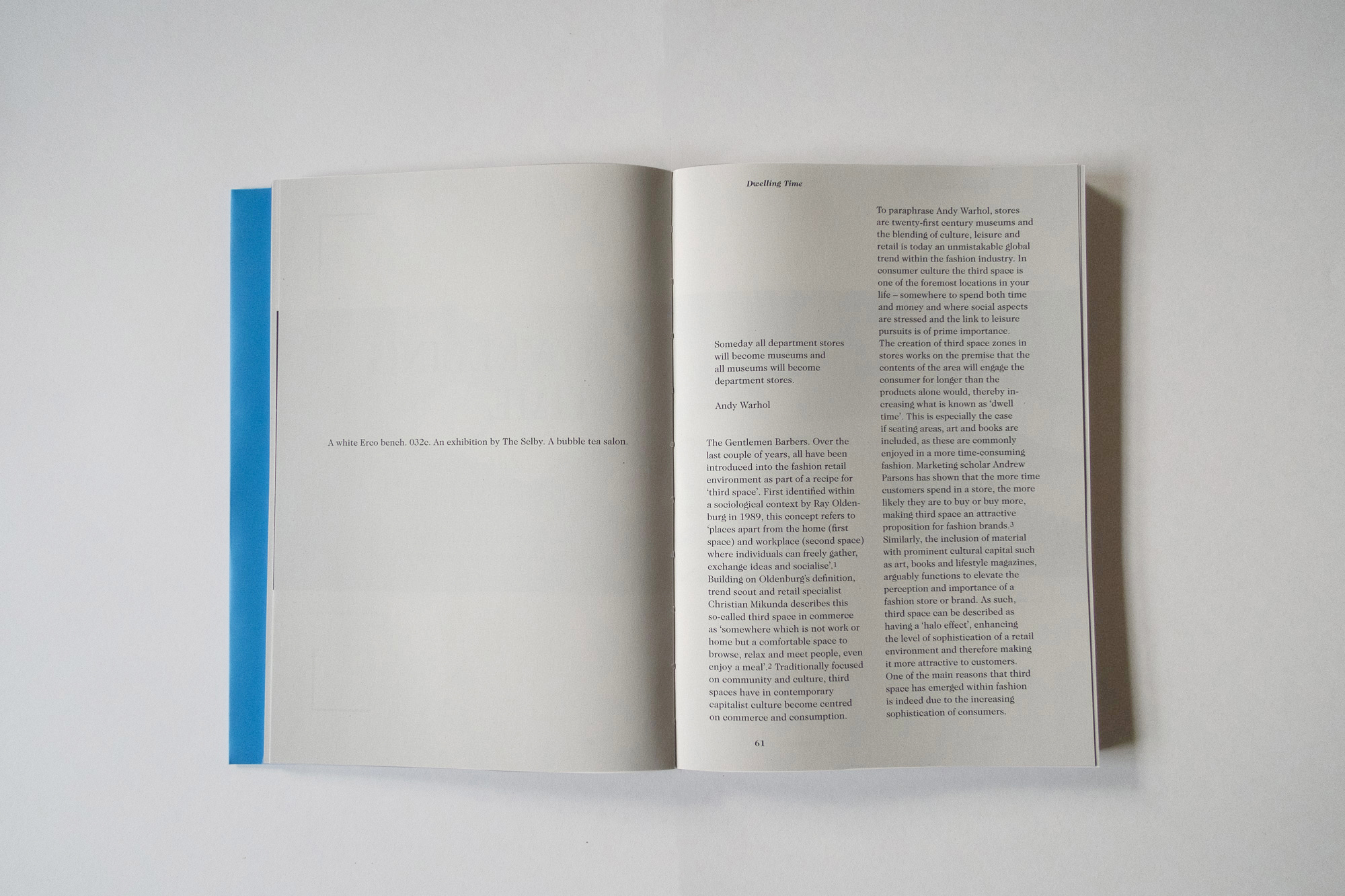
’When in doubt, use Caslon’ is an age-old typographer’s adage. William Caslon was an eighteenth century British type designer, who started a type foundry producing wildly popular alphabets cast in lead, to use with the letterpress printing techniques available at the time. This issue of Vestoj employs Caslon, in a variety of cuts (to be precise: Ed Benguiat’s ITC Caslon 224; Bitstream’s Open Face Caslon; Adobe Caslon; Caslon Old Face; and Founder’s Caslon, used for this text). None is more true to the original design than the other – the problem with trying to authentically reproduce letterforms of three centuries ago quickly becomes evident when considering that even Caslon’s own designs were anything but original. William Caslon was heavily influenced by Dutch letter designs that were already antiquated at the time. Adding to this is the fact that Caslon’s foundry produced a range of letterforms, but not one with the name ’Caslon’. When designers today refer to the font of that name, it could be any one of a wide variety of different revivals, varying in size, weight, contrast and pretty much everything else, but all with a very long, shared heritage harking back to the first Roman printed letterforms of the Renaissance.
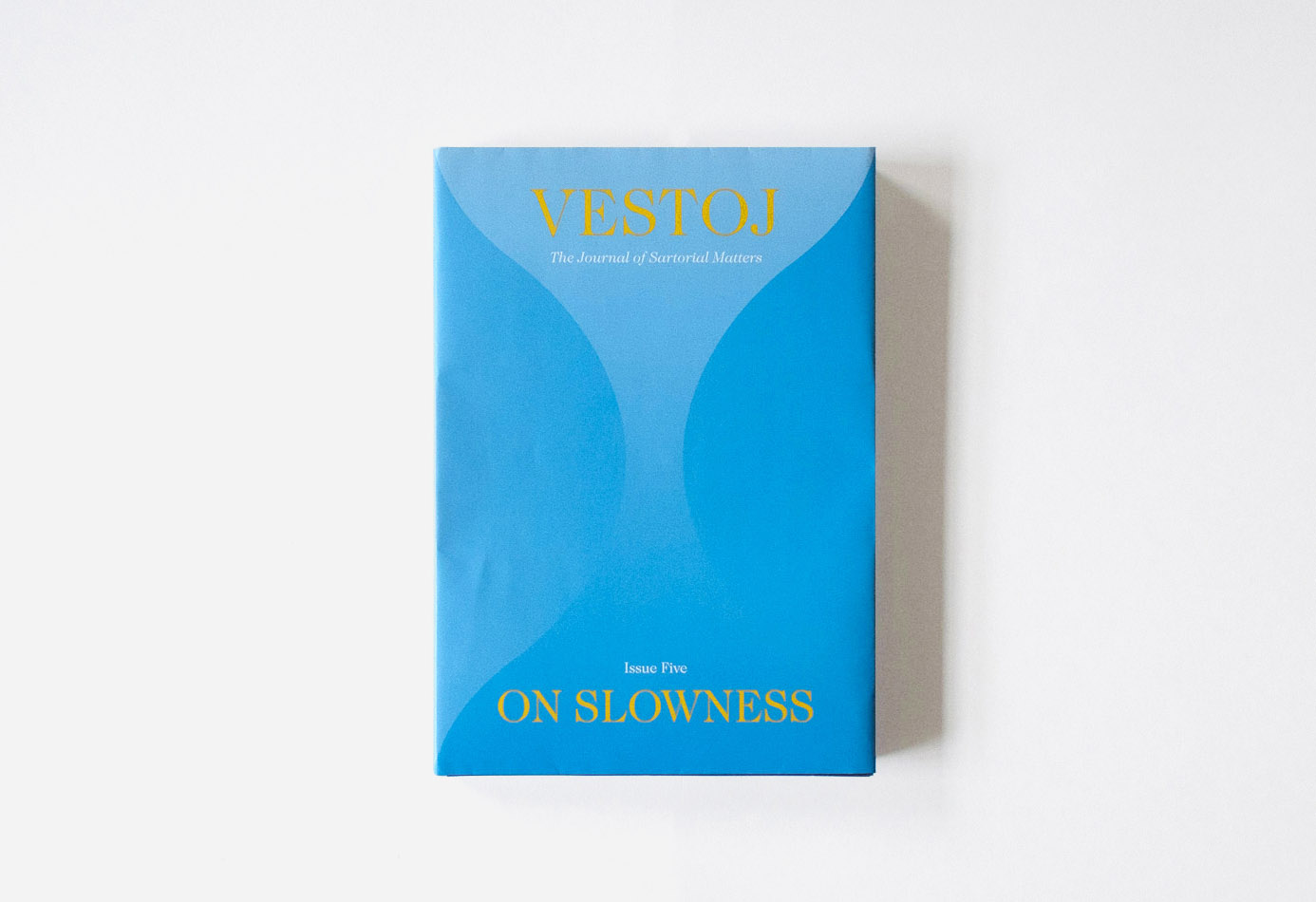
“A note on the type”, on the colophon of Vestoj Issue 5: On Slowness
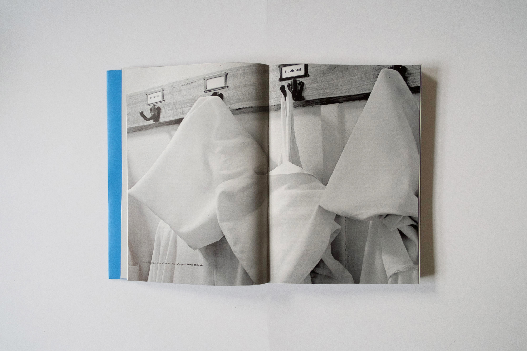
Each essay begins and ends with a single line reaching out into a blank page like a catwalk – the effect slows down the reader’s pace as each essay stretches out languorously. In the editor’s letter, Anja Aronowsky Cronberg urges us to take the time to knit something slowly (perhaps like the sweater from the magazine’s jacket): a way to combat the stressful effects of the quick pace of contemporary life. Slowing down the progression of how we read and engage with each page seems to therefore chime with her call to ‘take your time’.
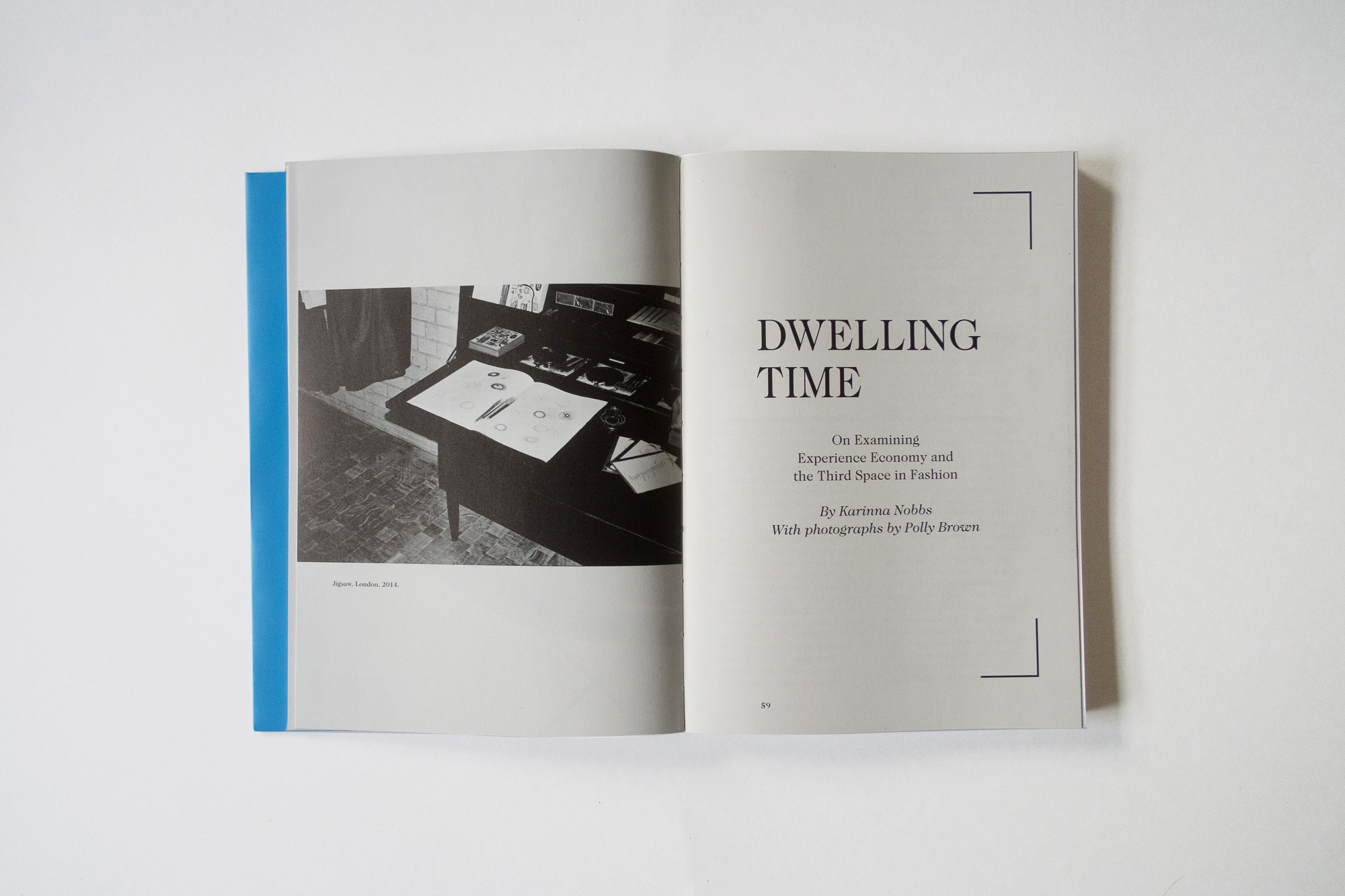
Vestoj emphatically demonstrates how intelligence can be beautiful, and how beauty can be intelligent. Point five of their manifesto could not be clearer: ‘Text and image shall be given equal importance. We must always integrate word and picture and guarantee that there is an on going dialogue between the two.’ Vestoj seamlessly achieves this harmony between text and image: its what makes it a magazine that is so easy to spend time with.
From "Magazine of the Week: Vestoj 5", Madeleine Morley, MagCulture, March 2015