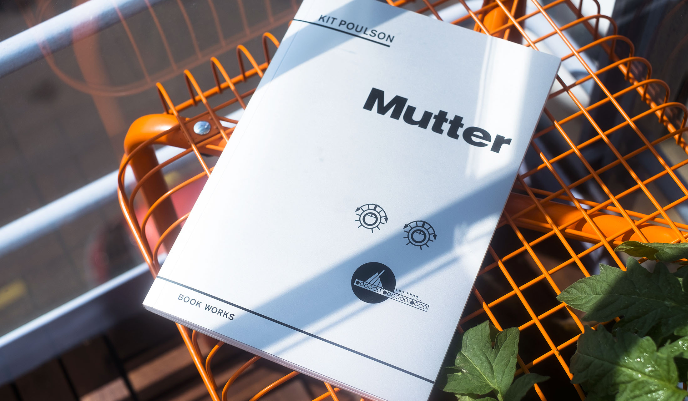
Book design for Kit Poulson's Mutter, published by Book Works in summer 2018. A novel written in concrete poetry, the typography aims to be at once playful and serious.
Filed under
Client
- Book Works
Year
2018
Collaborators
Typefaces
- ITC Cheltenham
- Space Mono
Another idea occurred: maybe the smells were coming through the high invisible window. That could mean that the outside was very different from how he had first imagined it. Maybe it wasn’t food he could smell but the memory of food. The stuff he saw around him was like the sci-fi food pills that could taste of anything you wanted. When young he had seen this predicted in a comic strip in the Beano and still found the idea disturbing. He wanted something a bit more solid, a bit more baroque. With the pills you would soon begin to lose the nuance and detail. It would be dependent on your memory or perhaps your imagination. And seeing as taste was a potent releaser of memory… this was problematic. A culinary mental feedback loop might trap you to the taste of endless madeleines. And…
He felt slightly nauseous.
Everything was becoming too internalized.